
Bollig Tours
Travelling with Bollig Tours.
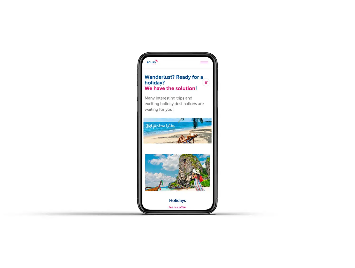
Homepage.
LOOK AND FEEL

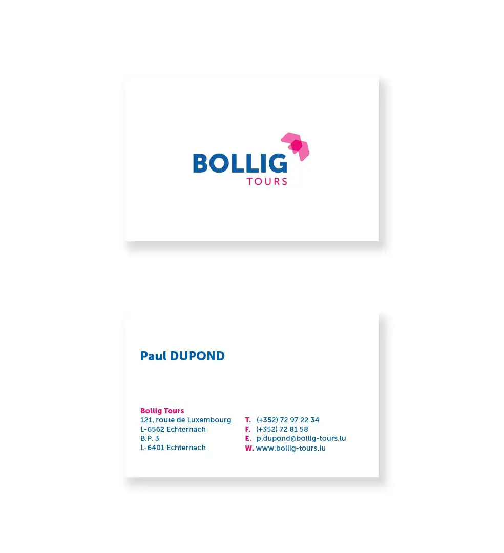
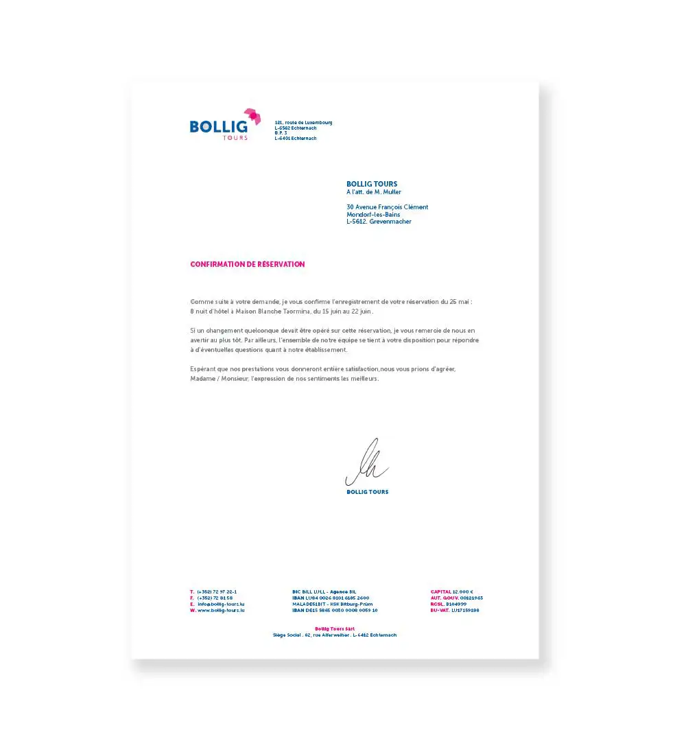
Letterhead and business card.
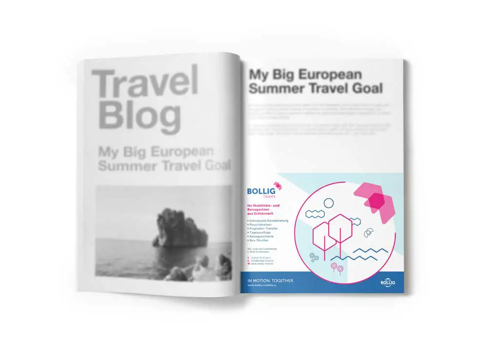
Magazine commercial.
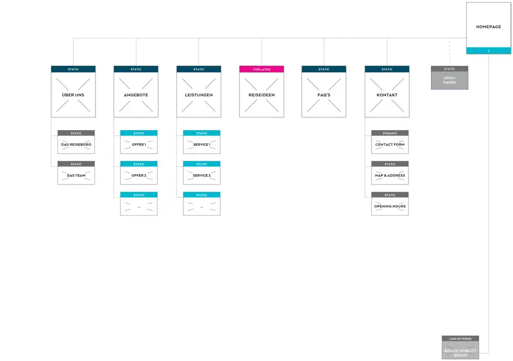
Website structure.
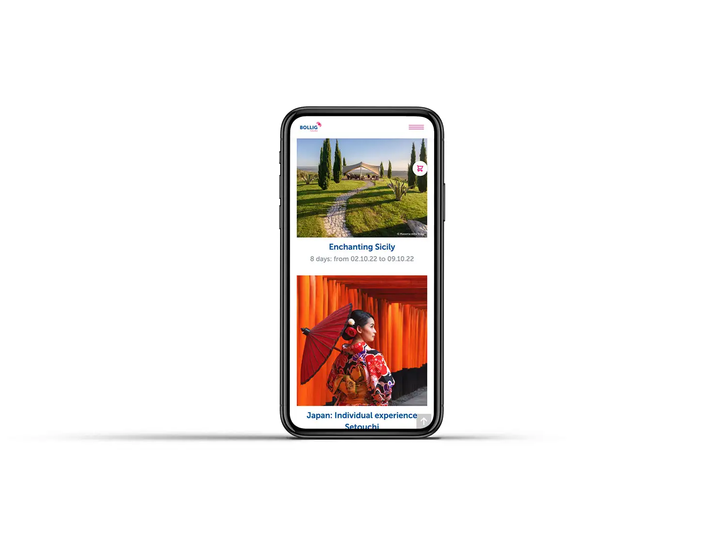
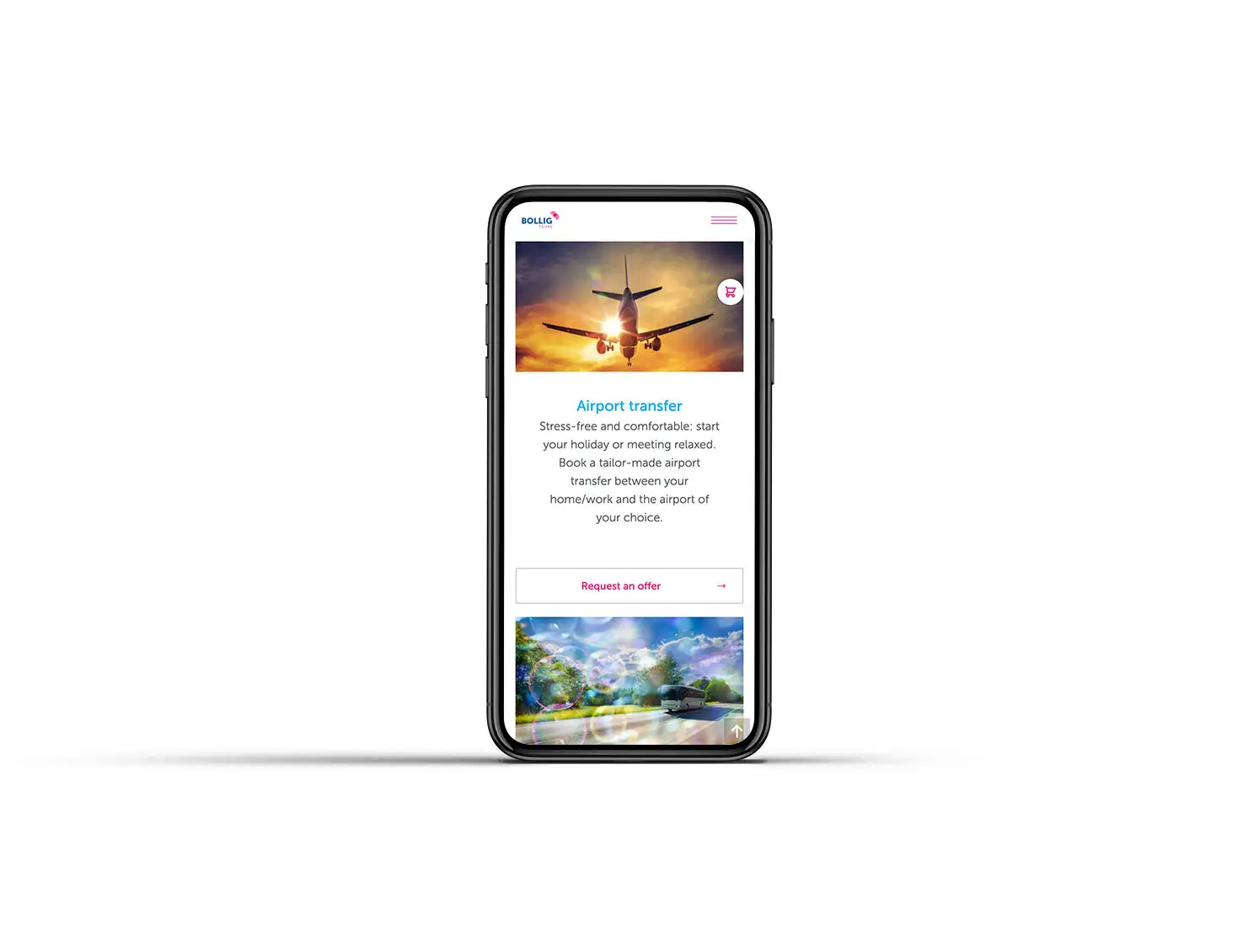
Responsive design.
Team

I’m pleased to have achieved a clean yet meaningful logo: The two arrows that form an icon of a bird are standing for the letter B. This signifies the constant movement of Bollig Tours.”
Florencia - Designernext project