University of Luxembourg
Never stop Learning.
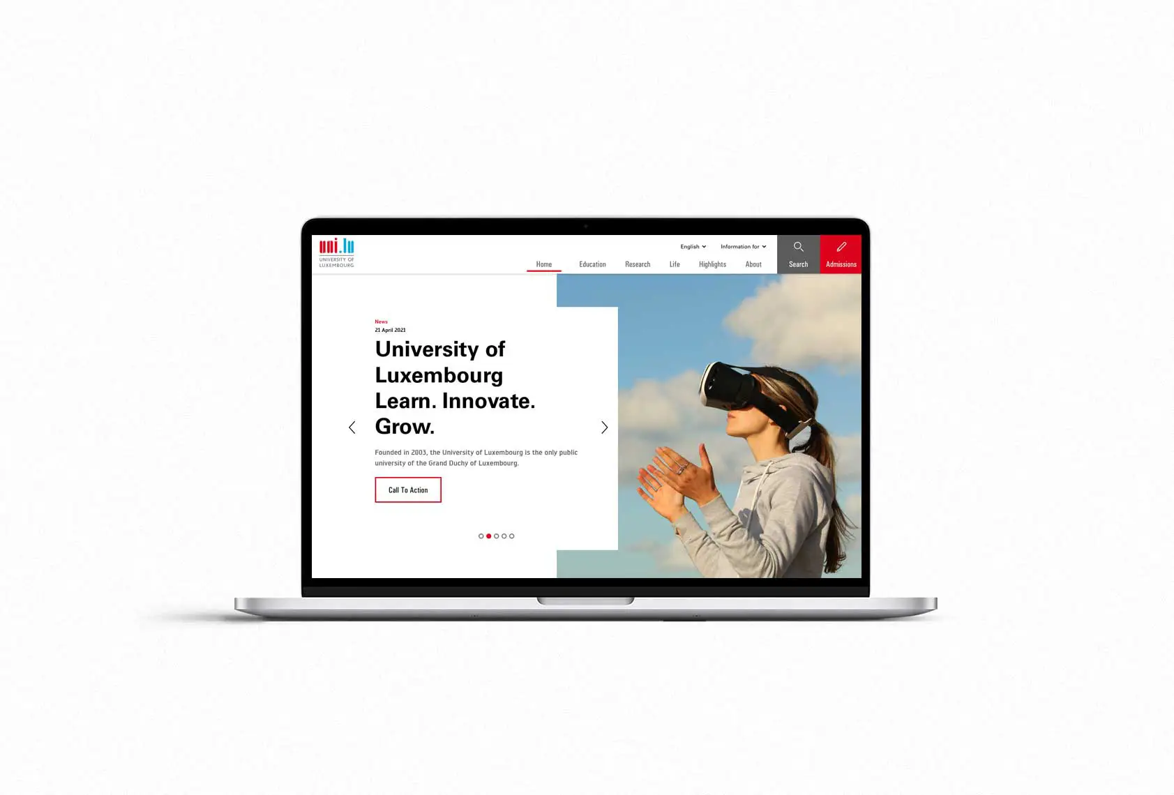
The University of Luxembourg (UNI) homepage.
Approach
look & feel
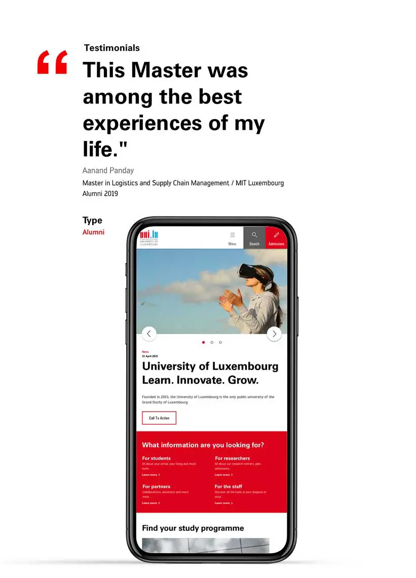
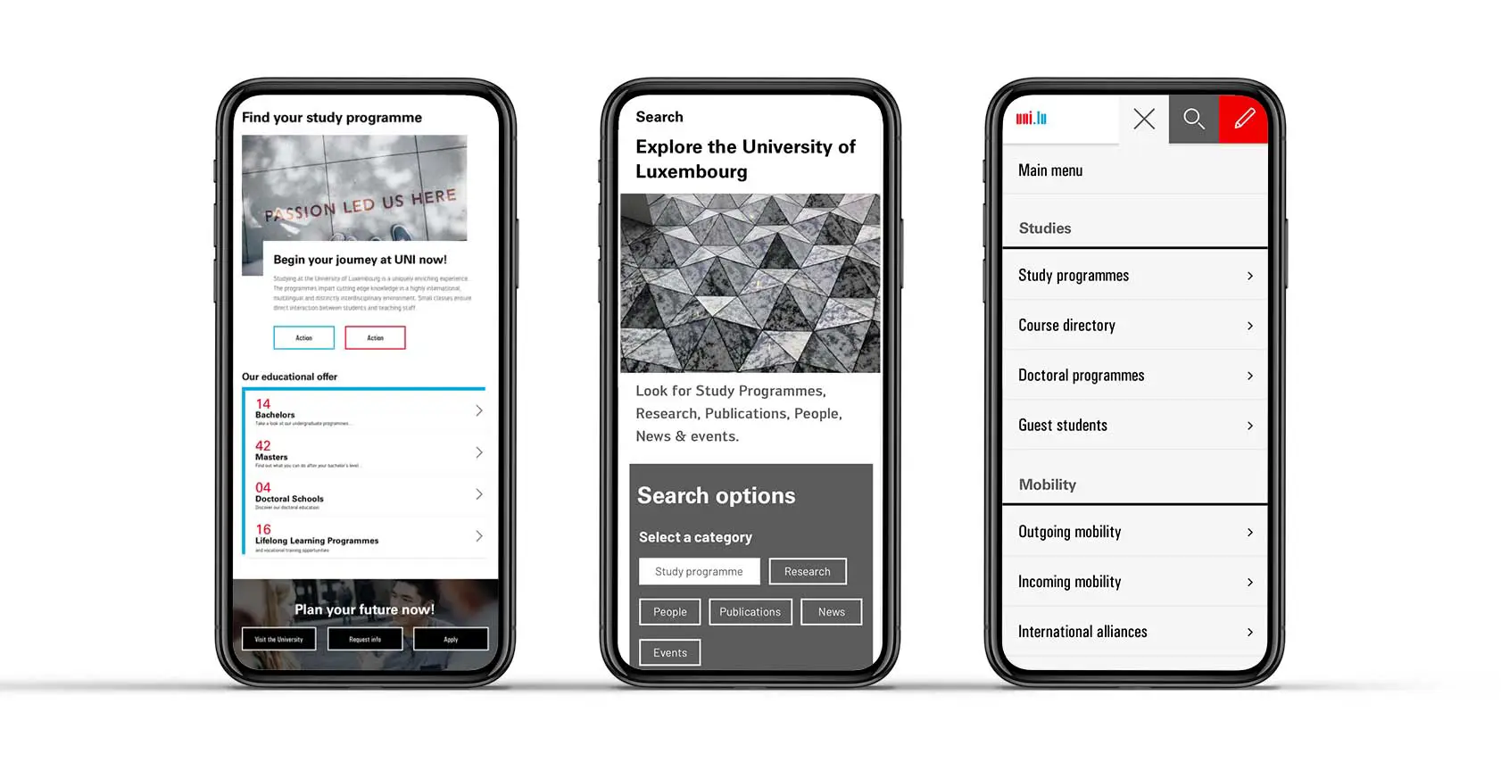
Mobile-friendly.
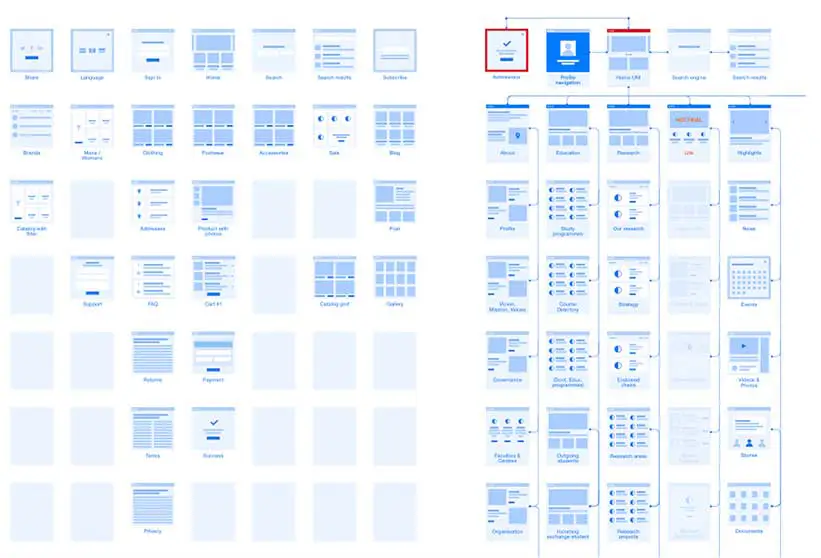
Website structure studies.
For the website’s architecture, we implemented a series of wireframes to create a user-friendly website which delivers up-to-date content and overall visibility online and optimises the quality of information and service delivery to the various stakeholders (researchers, teachers, students, individual visitors, journalists, etc.).
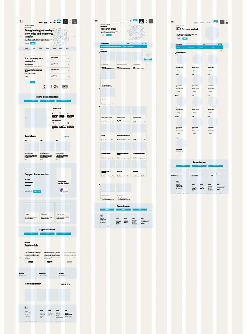
Wireframes.
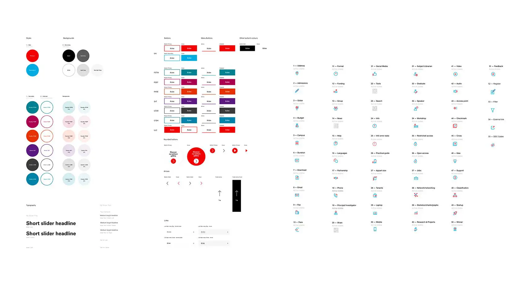
Part if the guidelines delivery.
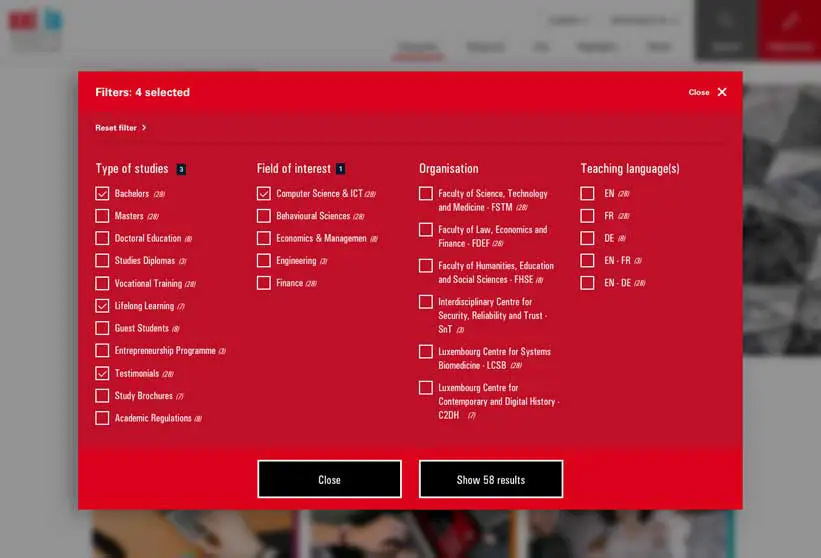
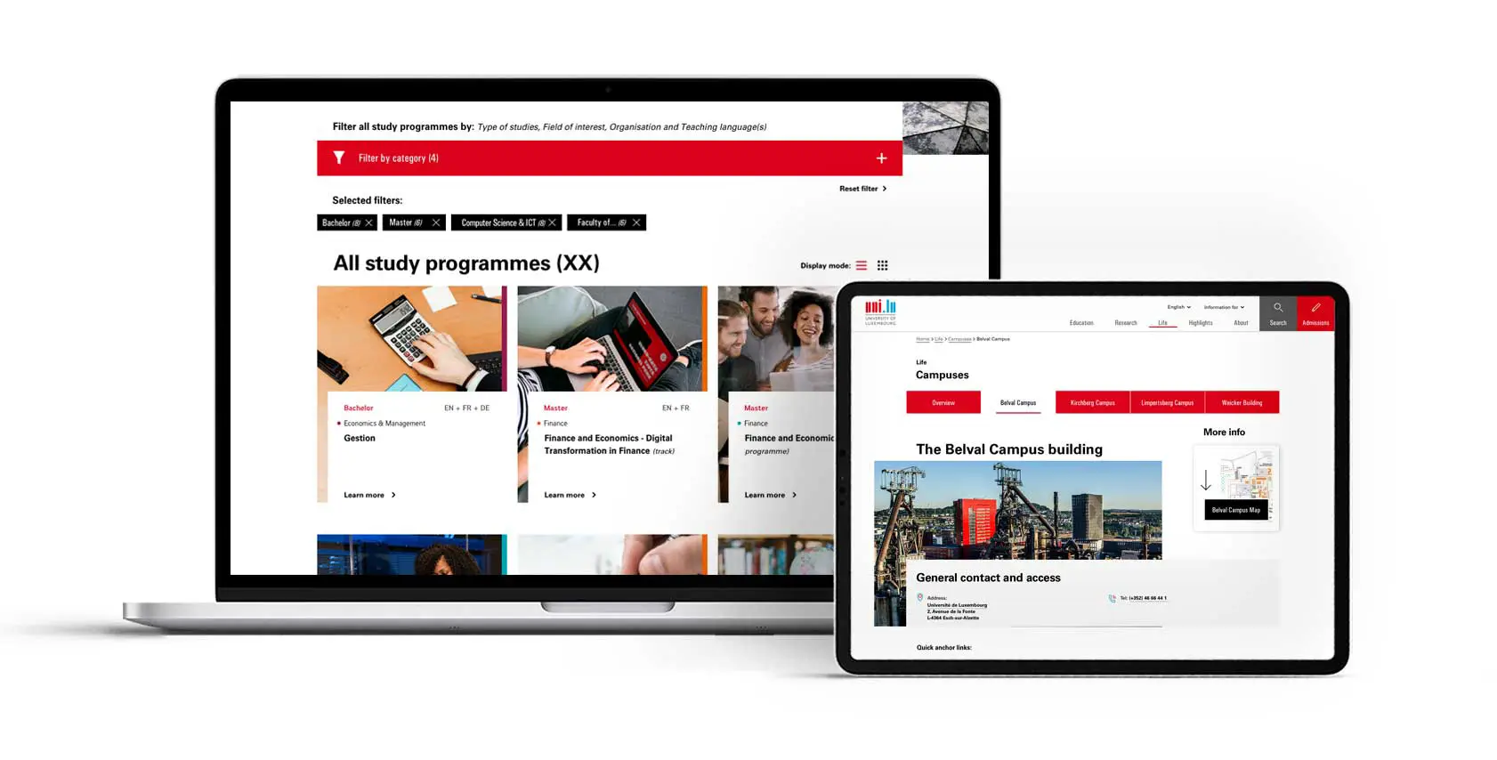
Filter mechanism.
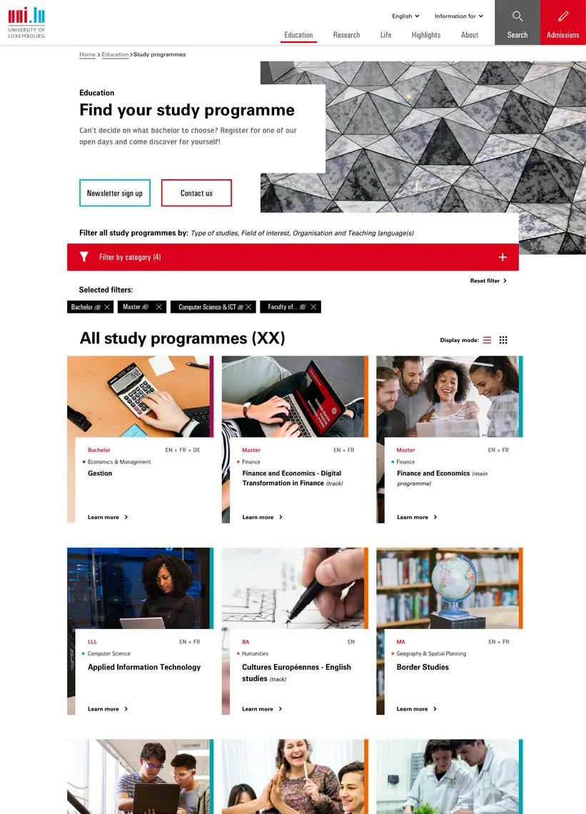
Study programmes display.
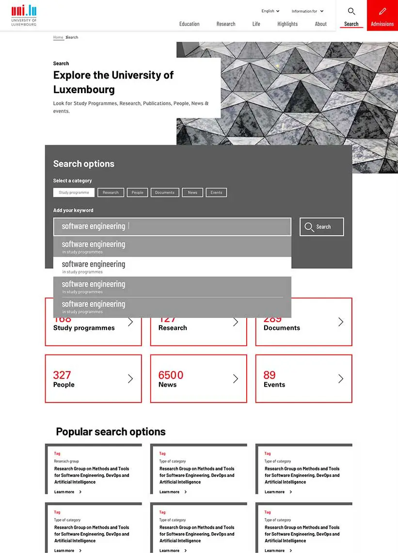
Search result page.
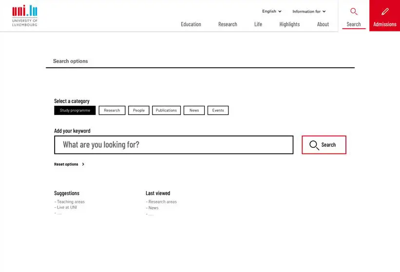
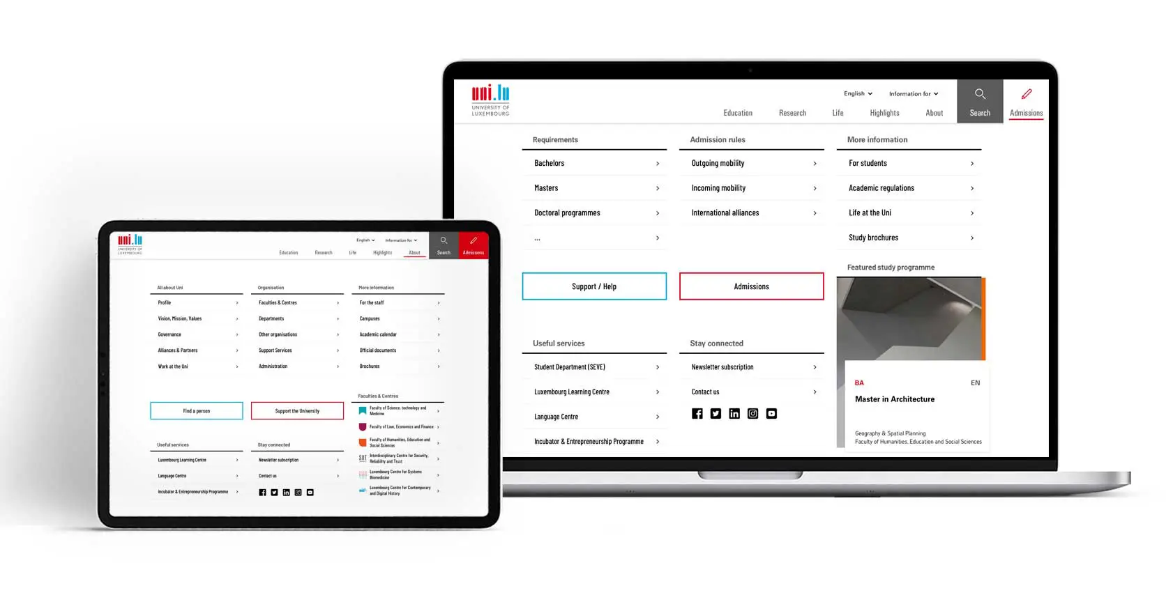
Main search function.

team

To rethink entirely this outdated website of 2006 using a new content management system, aiming to create a user-friendly, real-time, and contextually relevant platform with improved content quality, visitor understanding, and integration of various digital tools and applications, while also focusing on enhancing user engagement and student recruitment was for sure one of our biggest challenges ever.”
Nathalie - Creative Partnernext project
